The checkout page creates a pixel-perfect, fully responsive checkout experience for your users. Instead of just a static form, you can decide what information you want to collect and how it’s displayed to the user – all in a simple editor.
When you use the wizard to install the plugin, you optionally create a checkout page that contains a single checkout block. This block uses the default, single-column variation. You can edit that page as desired to choose a different layout.
All checkout blocks contain a shopping cart block by default. The shopping cart block shows sample data in the block editor that is not tied to your Stripe account;
Variations
The checkout block has three variations to choose from to get you started. These are just starting points and can be customized to create another experience you choose.
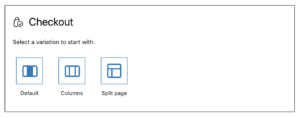
The blocks will look slightly differently based on your theme but you can customize it to get any style you want.
Default
The form and data are organized in a single column with the checkout button at the bottom.
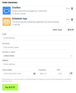
Columns
The inner blocks are split into two columns on larger screens and then shown as a single column on mobile. This design is built inside a stylized container.
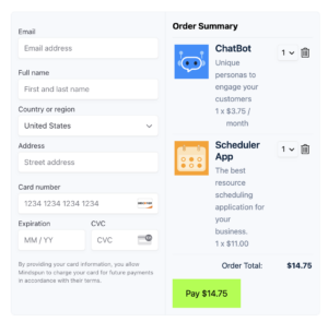
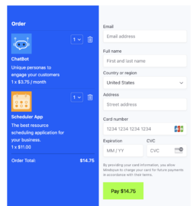
Split
The checkout block covers the entire page, with the shopping cart in the primary color. This variation works like the default Stripe Checkout experience but is far more customizable.
Inner Blocks
Everything in the above variations can be customized using the inner blocks of the parent checkout block.
Stripe Elements
The Stripe Elements block is a required child block of the checkout block. It’s what the users see when they pay for their purchases. You can collect any data you want, in any order you wish to, using the editor.
Except for the address block, all Stripe elements are required.
You can choose whether or not to include the address block: it’s valuable information and tends to help with spam, but it forces the user to enter additional information. Stripe automatically fills out most information, so including it is recommended.
Success Message
The success message block is shown to users after they finish checking out. This message is essential: by definition, it’s your first interaction with your new customer. Use it to inform your customers of the following steps for working with your product or otherwise engage them.
Cart Empty
This message is shown to users with no items in their shopping carts. This block is the same as the empty block for the shopping cart block.
When a user’s shopping cart is empty, this block is only shown, and the elements block is hidden.
 Mailing Address