These settings let you customize the look and feel of the plugin components – particularly the Stripe-generated form and buttons. These values can likely be obtained from your theme.
Stripe
The Stripe options let you control the look and feel of the form Stripe generates. This lets you control the Stripe Appearance API through an easy-to-use web interface.
Stripe provides the naming convention. For instance, ‘Color Danger’ is the color name that Stripe uses to show error messages.
Here are a few examples:
- Color scheme
- Border radius for the inputs
- Label positioning
Everything from the Stripe Appearance API can be configured through this no-code interface.
See the Stripe documentation:
Primary Button
This is the main button – it should match the primary color of your theme.
Clicking the primary button in the sample form simulates submitting the form to demonstrate error handling.
Background color
The color of the button itself. This should be the primary color of your site and should be a color that attracts attention since the purchase button will be the direct call to action.
Text Color
The color of the button text. Make sure that this color sufficiently contrasts with the background color.
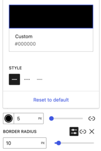
Border
Controls the border style and directly maps to the underlying CSS properties.
Note that you must set the border color, width, and style for the border to be visible.


Hover background color
The color of the button background will turn when the user hovers over the button. This color may be the same as the background color.
Hover text color
The color of the button text changes when the user hovers over the button. This color may be the same as the text color.
Secondary button
This button is used for non-main choices, such as ‘cancel.’ It should be configured to be more prominent than the primary button. The background color is often a shade of grey, but it could be a secondary color from the theme.
The options are configured using the primary button above.
Clicking the secondary button on the sample form resets the form to its original state.
 Mailing Address